The branding of big-name brands like Apple, Nike, and Starbucks is often used as an example of successful marketing efforts. And why not? These brands spend big money on traditional and digital advertising methods to stay in front of their customers. No wonder Apple doesn’t need to use the wordmark “Apple” with its pictorial “apple with a bite” logo.
But what about small brands? Do they need to be as serious about their business’s branding? Should they also prepare a brand guide to help their team stay consistent with the business’s messaging?
If you own a small business or start-up, you must have a clear picture of the type of people with whom you want to serve or work. That will determine the personality of your brand and attract like-minded people to your business. Small businesses need branding to build a group of loyal patrons who keep supporting and promoting it to their friends.
The personality of your business comes out through its logo, typography, colors, vision, mission, tagline, brand voice, core values, packaging, and other elements. That’s a lot to think about.
You may be able to run your business perfectly well, but branding requires a consistent and effective effort that represents a smart strategy to scale your business. (And that’s where Frictionless comes in; visit our website to learn more!)
Where Does a Brand Guide Come In?
A brand guide (also known as a style guide, brand book, or brand style guide) contains all the rules and principles your team will use in the brand’s marketing collateral. In the process of creating a brand guide, you and your organization’s founding members should collaborate with an internal or outsourced team with the necessary skills to translate the personality and identity of your brand from mere thoughts into reality.
Upon finalizing the branding elements, the rules and instructions are written down to help writers, designers, coders, distributors, agencies, franchisees or anyone else who represents your brand to reproduce the branding elements exactly as you intended.
This will enable you to remove any potential confusion among customers that may be caused by mixed messaging. If a familiar logo suddenly changes from red to violet in an advertisement, people might think it’s a scam.
Innovative software platforms like Frictionless can save you time by providing the tools you need to build a comprehensive brand book that your team can easily access. It lets you create and organize your CX strategies, vision and mission, core values, iconography, name and logo usage, and other elements into an easily accessible format.
Frictionless can also help you with defining company culture, sales and marketing strategy, as well as developing a solid brand identity. Click here to learn more about how Frictionless will empower you and your organization to work on the business, rather than in the business .
10 Examples of Great Company Brand Guides
We’ve crafted the following examples to serve as some inspiration as you work on developing your company’s brand guide.
1. Burger King
Burger King’s color palette reflects the American spirit of recreation, cheerfulness, and a hint of rebellion. The brown, orange and red colors in its branding suggest a leisurely barbecue party in the backyard. The brown furniture used in Burger King restaurants has a hand-crafted, textured, and layered feel to remind customers of gatherings with family and friends, tasty food, and good times.
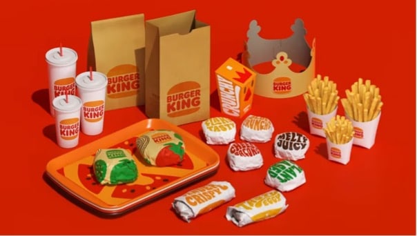
Burger King uses a proprietary typeface called “flames”, which is designed to match its world-famous delicious round burgers.
The logo has been rebranded to represent a simple and minimalist design. The logo’s original blue crescent has been removed to symbolize the extraction of artificial colors and preservatives from the recipes.
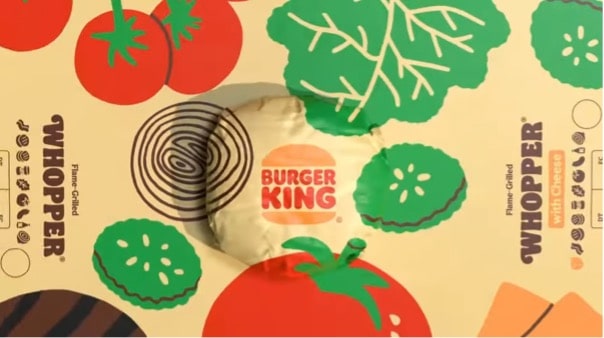
The brand also uses bold green, red, yellow, and brown images of salads and other ingredients that make their burgers tastier.
All in all, Burger King has successfully established its image as a bold and cheerful hangout spot for families and friends who crave delicious and fresh food.
The theme is consistently reflected in the interior design of its franchise restaurants, menu cards, crew uniforms, website, and signage.
Burger King’s mission statement “to offer reasonably priced quality food, served quickly, in attractive, clean surroundings” is realized in the clean Burger King restaurants and the well-dressed staff working in them.
Click here to check out Burger King’s brand guide.
2. FedEx
FedEx considers its prime duties to be punctuality, clear communication, and high standards of service. In short, this company doesn’t want to miss any opportunity because of miscommunication or mismanagement.
FedEx’s brand guide mentions its core values of simplification, optimization, invention, connection, certainty, and personalization. Its visual elements and brand voice reflect these values and use professional and clean colors, typefaces, and logos in all communication materials.
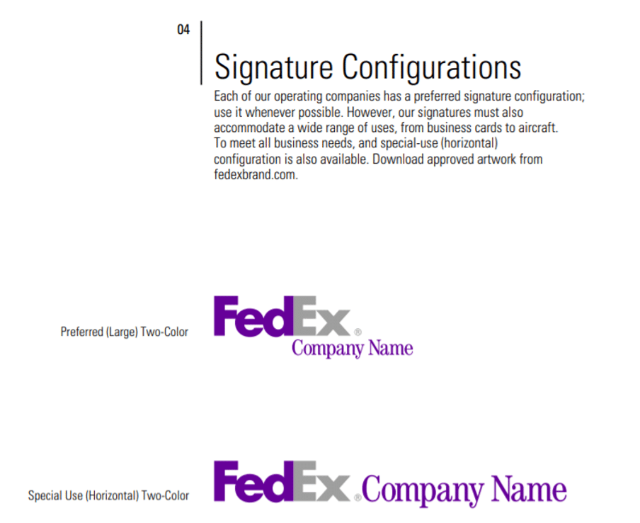
FedEx’s branding guide instructs designers to make the wordmark stand apart from other text and graphics. The clear space between the FedEx logo and other text or images must be equal to the height of the x in the FedEx wordmark.
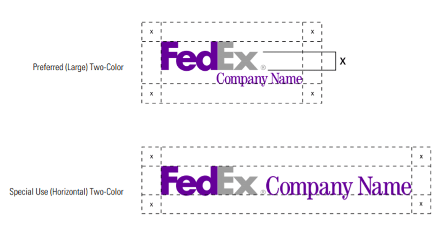
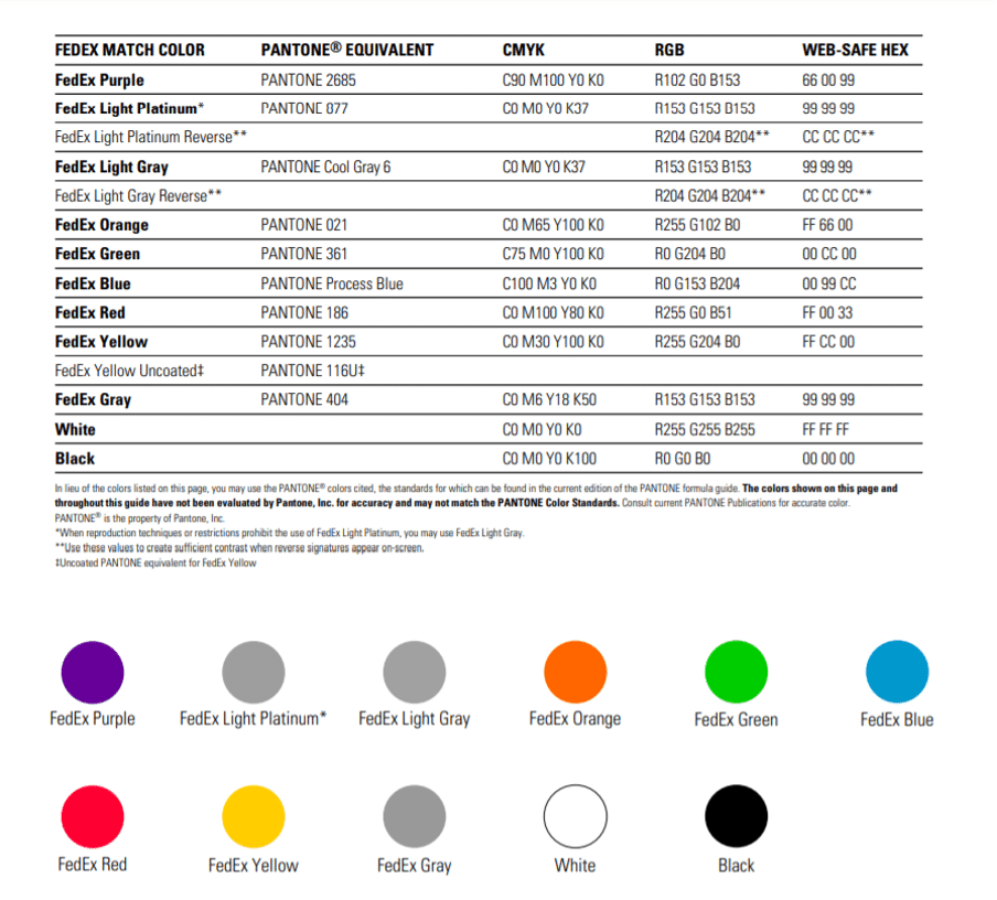
These logos convey the brand’s commitment to simplicity through professional-looking color combinations of purple, grey, red, orange, yellow, and sky blue.
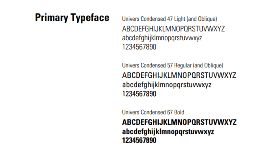
The Univers typeface adds a professional, non-distracting look to the FedEx logo and the company’s marketing collateral.
Check out FedEx’s brand book here.
3. EDGE Buildings
EDGE has built and developed its brand in the environmental sustainability market. It works with construction companies and maintains an authoritative brand voice in its communication and visual elements. According to its mission statement, EDGE strives “to mainstream resource-efficient buildings by combining speed with market intelligence, proving the business case that everyone wins financially by building green.”
The logo consists of a simple typeface and the EDGE acronym stands for “Excellence in Design For Greater Efficiencies.” The primary brand colors of blue and green are found in the logo and throughout the EDGE website and its collateral. The green color symbolizes environmental efficiency and sustainability, while blue represents serenity and health.
EDGE prefers the sans-serif typeface Frutiger for its communication materials. The secondary typeface is Verdana. Both offer great legibility across different mediums while not appearing as too formal.
The EDGE brand voice speaks of excellence, innovation, and taking a step toward a cleaner and greener future.
Click here to check out EDGE’s branding style guide.
4. LEGO
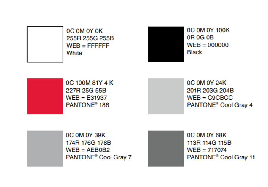
LEGO inspires creativity, fun, and learning for both children and adults. And clearly, it has ensured that these brand values are reflected in its company’s logo, collateral, website, and other communication materials. The prominent red, yellow, black, and white colors recall the classic LEGO blocks. Red also attracts attention and represents cheerful energy.
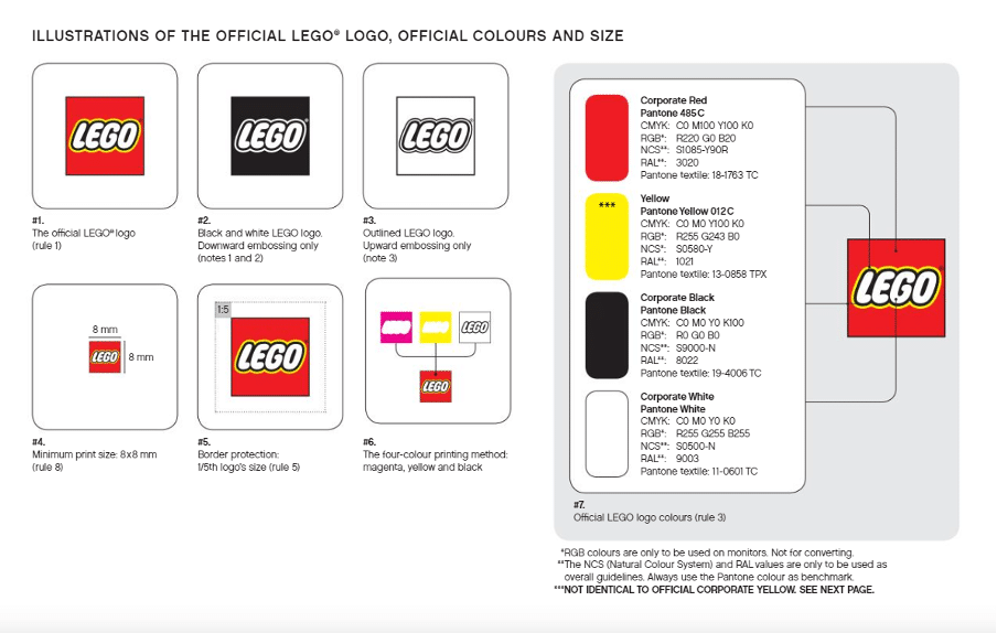
The word LEGO in white letters with black and yellow bordering expresses the clean and simple joy of playing with LEGOs as building blocks.
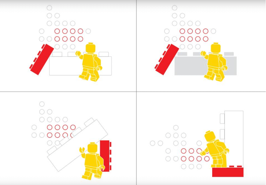
The yellow Minifigure is the symbolic representation of all the characters in the LEGO universe. When used with the LEGO brick, it signifies the ever-evolving LEGO universe and the possibility of making an unlimited number of complex creations. LEGO’s mission statement of “inspire and develop the builders of tomorrow” is true to its promise.
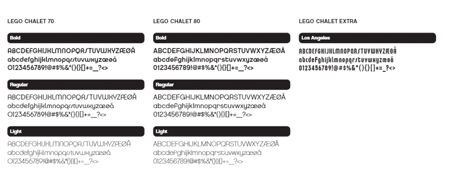
The typeface used in LEGO branding is called LEGO Chalet, a clean and easy-to-read typeface.
Click here to check out LEGO’s brand book.
5. Tesla
With the mission statement to create the most compelling car company of the 21st century by driving the world’s transition to electric vehicles, Tesla is setting the standard for electric vehicle companies.
Contrary to popular belief, Tesla’s electric vehicles are on par with gasoline vehicles in terms of performance. Tesla’s brand guide makes it clear that Tesla is a performance brand, not a luxury one.
Tesla deliberately uses on-point messaging without trying to be clever or sarcastic, as it understands that its target audience is a busy one.
Red, black, and white are Tesla’s brand colors. The branding material also uses three shades of grey in suitable situations to make the logo comprehensible.
Tesla has three representative logos. The Tesla “T” logo comes from the cross-section of an electric engine, a popular theory that was confirmed by Tesla founder Elon Musk in a tweet.
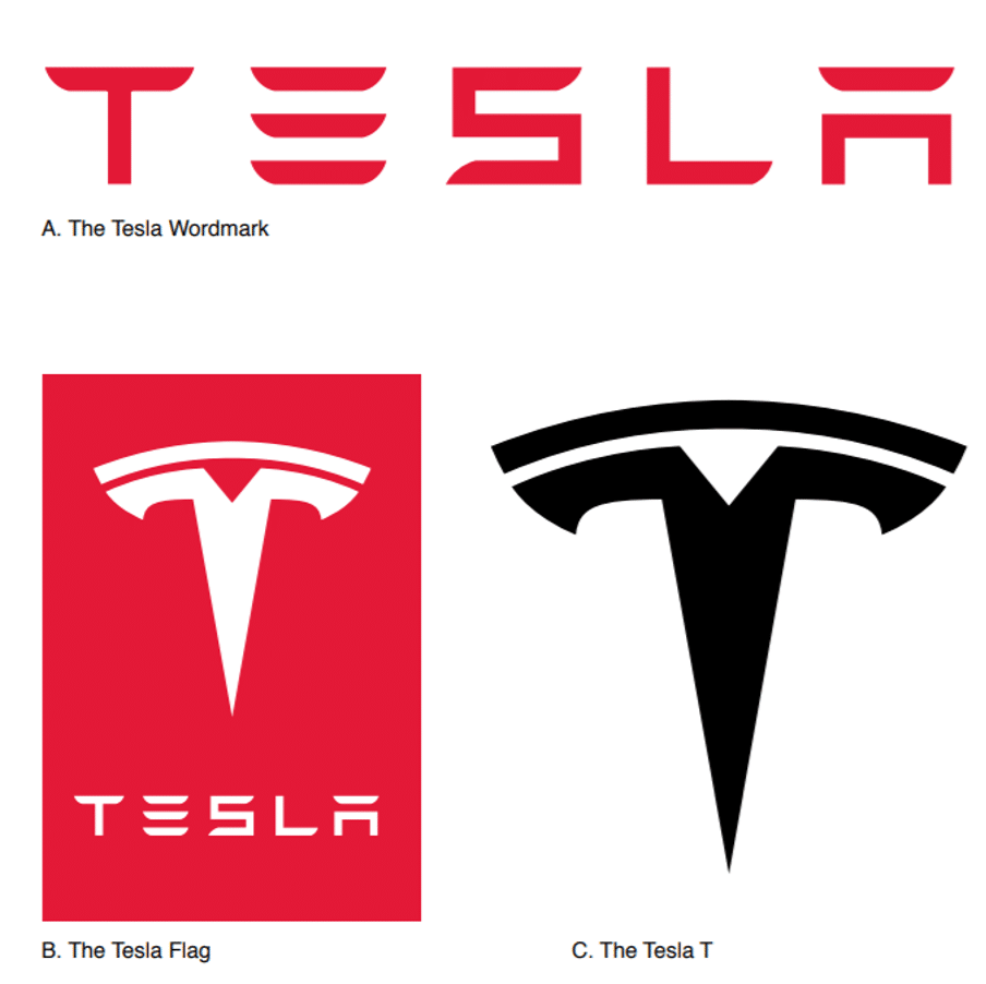
The TESLA wordmark represents the company’s vision to facilitate the world’s transition to electric vehicles and lets everyone know that electric vehicles don’t compromise on performance.
Click here to check out Tesla’s style guide.
6. Delta Air Lines
Delta is one of the leading airline companies in the US. Given Delta’s current number of customers, it’s clear the company has actualized its vision “to be the world’s most trusted airline.”
Its core values consist of honesty, persistence, perseverance, respect, and servant leadership. Consumers expect responsibility and punctuality from an airline, and Delta’s brand voice is successful at instilling confidence in its brand.
Delta Air Lines uses the Delta Brand logo in four color variations and incorporated a simple widget with the words DELTA spelled out utilizing a modern font and ample letter spacing.
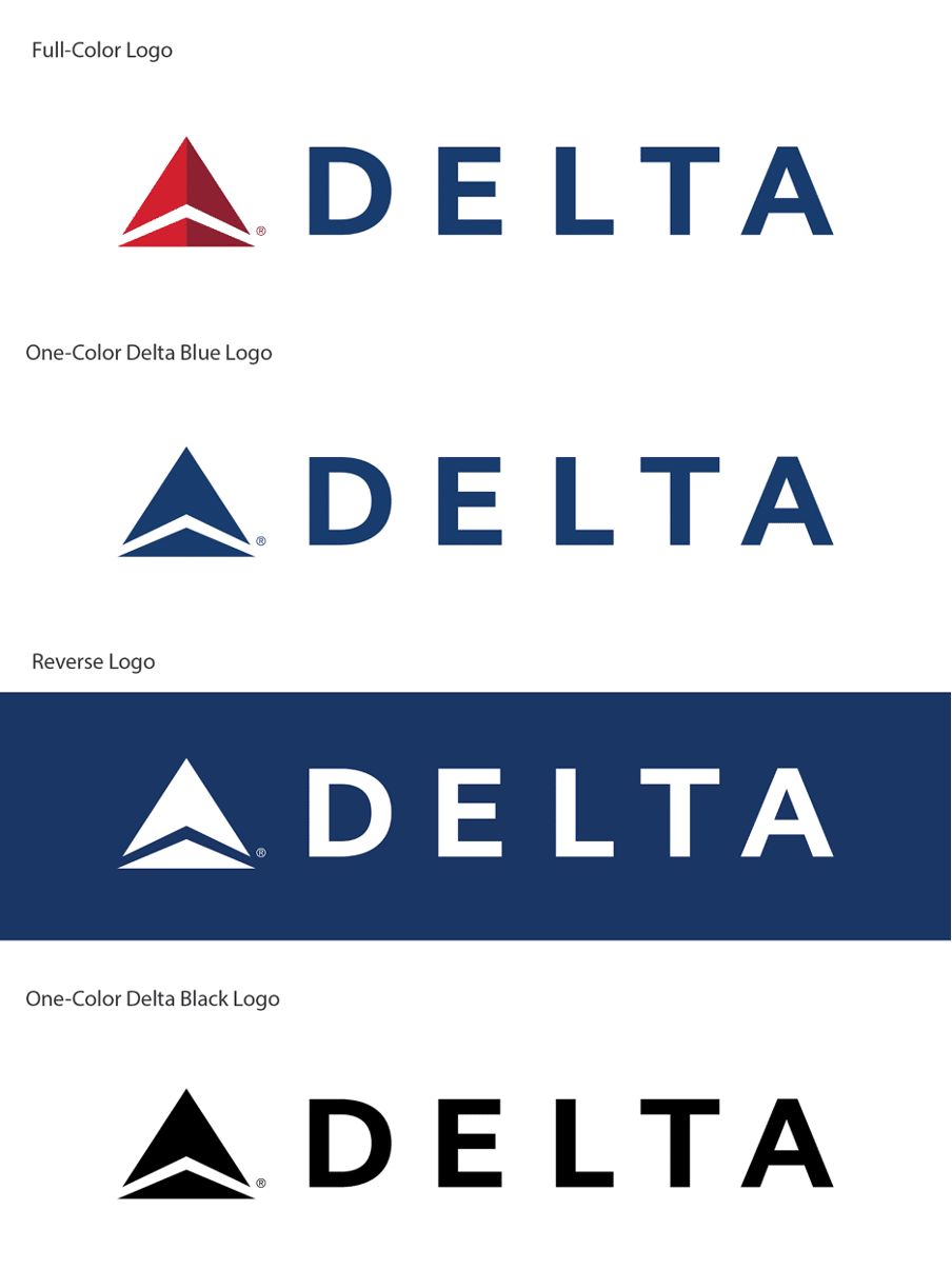
Delta is the fourth letter of the Greek alphabet, which is represented in the logo with a triangle. In 2007, the company changed its logo by combining a triangle and the view of a jet flying overhead.
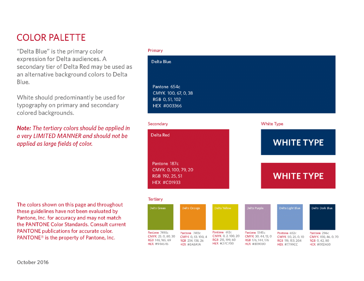
The color palette consists of delta blue and delta red, a sophisticated yet inviting color combination.
Click here to check out Delta Air Lines’ brand book.
7. Toyota
Toyota’s symbol looks elementary at first glance. However, it would be unfair to not appreciate the thought behind its design. Designers for Toyota spent five years on the latest version of the logo on it to ensure that it would be welcomed around the world. The logo comprises of three ellipses, and it should be noted that the two smaller eclipses form the letter “T.”

The logo is symmetrical so that it looks the same whether it’s viewed normally or through a rear-view mirror.
Toyota has issued three logos, two of which are used in marketing materials, and the third is utilized in corporate communications.


The tagline “Let’s Go Places,” which accompanies the logo, signifies a sense of free-spirited adventure.
The messaging and tagline aspire to make the driver appreciate the innovation, safety, and durability built into every Toyota vehicle.
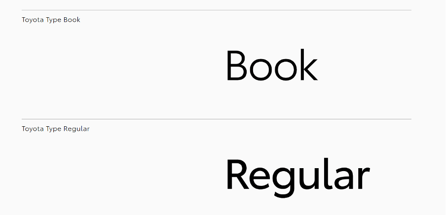
Toyota developed its typeface, Toyota Type, for use in branding materials.
Apart from the well-known red and white, Toyota also utilizes black and grey to improve legibility.
Click here to check out Toyota’s brand guide.
8. Scrimshaw Coffee
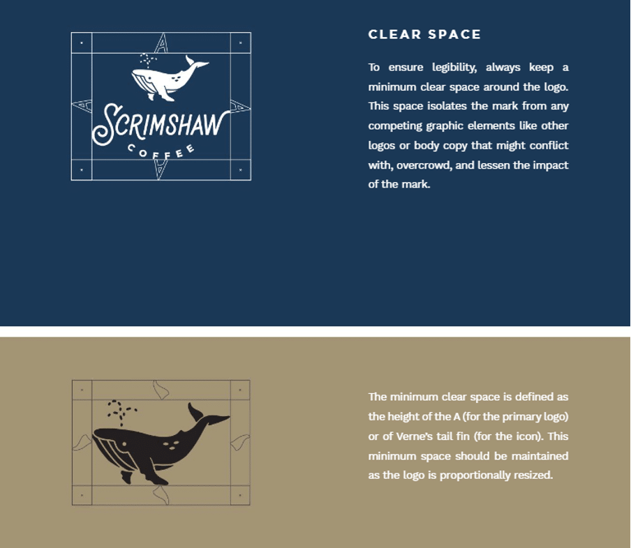
In its branding, Scrimshaw Coffee incorporates a warm and inviting color palette, laid-back typeface, and nautical logo.
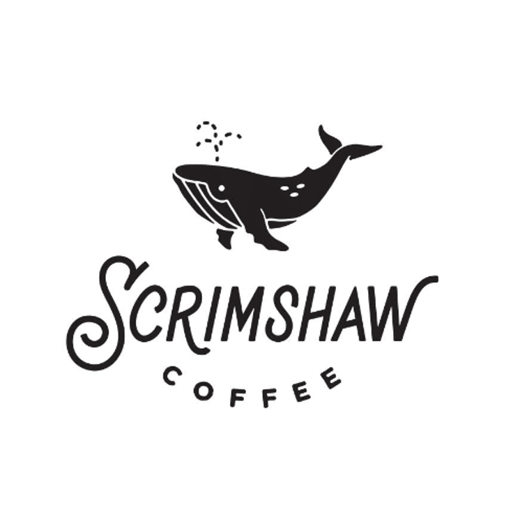
The word “Scrimshaw” refers to the whalebone scrolls, engravings, and carvings that sailors used to carve to pass the time. The logo represents the brand’s hand-made ethos. The wavy typeface combined with the whale character conjures a nautical vibe. The whale character in the logo makes the logo memorable and recognizable.
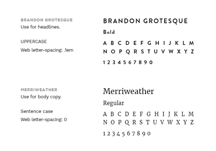
The Brandon Grotesque and Merriweather typefaces used in the collateral look modern, both in print and on the web.
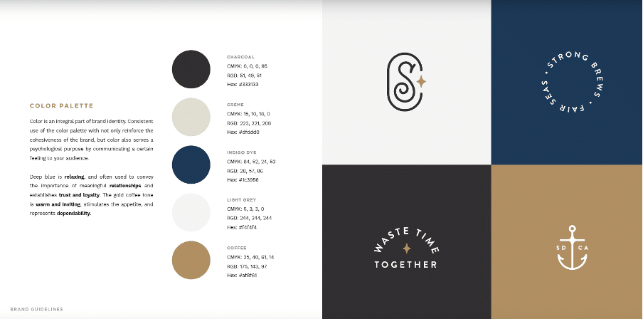
The color palette consists of warm, relaxing, and appetizing colors. The charcoal, creme, indigo dye, light grey, and coffee colors work together to enhance the brand’s laid-back nautical feel.
The brand’s core values reflect a company that is humanistic and relaxed, as well as serves hand-made products.
Click here to check out Scrimshaw Coffee’s brand guide.
9. Pearson
Pearson strives to revolutionize learning through its in-depth courses for people pursuing higher studies. Its platform is designed for researchers, job seekers, learning enthusiasts, teachers, and parents. The brand voice projects excitement about learning and the new possibilities that arise from it.
“Fun” and “discovery” are two words that represent the brand well. Pearson’s brand guide explains the theory behind the company logo. It’s an interrobang (?!) encapsulated within a thumbprint. The combination of a question mark (?) and exclamation mark (!) is used to represent a question asked with excitement.
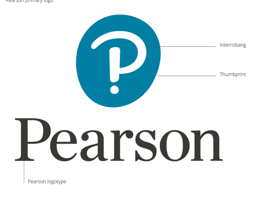
Pearson’s color palette consists of white, black, and shades of blue that produce a soothing effect on the viewer. The blue color represents calmness, trust, and intelligence.
Click here to check out Pearson’s style guide.
10. Harley Davidson
Harley Davidson’s mission states, “We fulfil dreams through the experiences of motorcycling, by providing to motorcyclists and the general public an expanding line of motorcycles and branded products and services in selected market segments.”
The company’s branded merchandise provides Harley fans and customers with a sense of belonging. The brand excites the rebel inside every ordinary person.
The Harley Davidson logo has gone through several rounds of modernization, but the current logo resembles the original “bar and shield” logo that came out in 1910. The origin of the logo is unknown, but we can infer that the logo conveys strength and boldness.
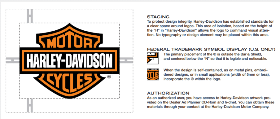
The bar-and-shield design is often found on pins used by their followers to show its commitment to the “Harley Davidson” lifestyle. Harley Davidson has earned a cult-like status because of the quality of its products. You don’t generally see people getting a company name tattooed on their arm.
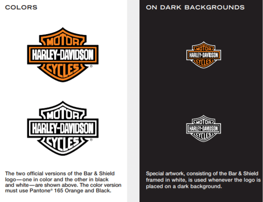
Harley Davidson has two variations of the logo for dark and white backgrounds. The logo is impactful with the use of clear space and staging.
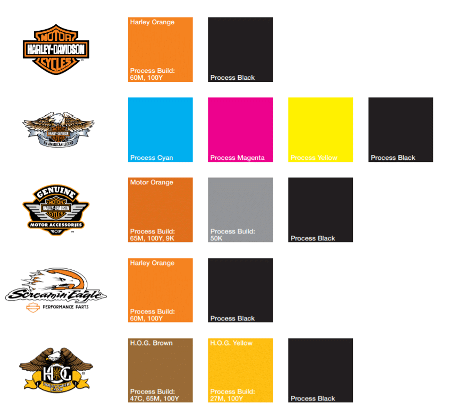
The brand guide describes the correct usage of color for various logos. Shades of orange are used consistently, and the color is generally associated with expression, freedom, and enjoyment.
The brand uses five different typefaces for different scenarios.
Click here to check out Harley Davidson’s branding guide.
It’s Time To Build Your Brand Guide
If you’re starting a new business, don’t be afraid to start small. Harley Davidson produced only about 50 bikes per year in its early years and gradually increased production to 150 bikes after four years of its establishment. While witnessing its ascension to popularity, we must not forget that it has been in the works for over a century.
Your brand book may undergo several revisions for various reasons, such as a shift in company values and the need to address a different market segment or to adapt to innovation.
With its all-hands-on-deck approach, Frictionless will guide you through the discussion, workshop, and brainstorming phases to build your core values and brand identity.
Ready to build a brand guide that will align your teams and employees, gain marketing traction, win more deals, and thrill your customers?
Visit our website to register today.